The Art of Typography: Choosing Fonts for Effective Logo Design
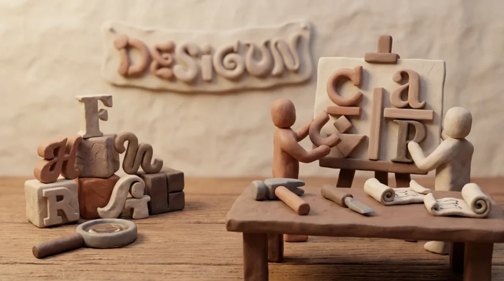
Discover the pivotal role typography plays in logo design and learn how to choose fonts that enhance brand identity and communication.
Typography in logo design is not just about selecting a font; it’s about choosing a typeface that resonates with a brand’s identity and communicates its message effectively. The right typography can transform a simple logo into a powerful brand statement.
The Importance of Typography in Logo Design
Typography in logo design serves as a visual representation of a brand’s character. A well-chosen typeface can convey emotions, authority, and style. It’s crucial to understand that typography goes beyond aesthetics; it plays a significant role in how a brand is perceived. A bold, sans-serif font might suggest modernity and strength, while a script font could evoke elegance and tradition.
Understanding Font Styles
Fonts are generally categorized into serif, sans-serif, script, and display. Each category serves a different purpose. Serif fonts, known for their traditional appearance, are often used by companies wanting to project reliability and timelessness. Sans-serif fonts, with their clean lines, are preferred by brands looking to appear modern and approachable. Script fonts add a touch of sophistication and are ideal for luxury brands, while display fonts are often used for creative and bold logos.
Choosing the Right Typeface for Your Brand
Choosing the right typeface involves understanding the brand’s personality and target audience. For instance, a tech company might opt for a sleek sans-serif font to align with innovation, whereas a children’s brand might use a playful display font. It’s essential to ensure that the chosen typeface aligns with the brand’s core values and appeals to its audience.
Balancing Typography with Other Design Elements
Typography should harmonize with other elements of logo design, such as color and imagery. A cohesive design ensures that all components work together to convey the brand message. Balancing typography with other elements can enhance the overall aesthetic and effectiveness of the logo. For more insights on maintaining design consistency, consider reading about consistency in logo design.
The Role of Typography in Branding
Typography is a crucial aspect of branding as it helps establish a brand’s voice and tone. A distinctive font can become synonymous with a brand, making it instantly recognizable. It’s important for brands to maintain consistency in typography across all platforms to strengthen brand identity and customer recall.
Adapting Typography for Digital and Print Media
With the rise of digital media, it’s vital for logos to be adaptable across various platforms. Fonts that look great in print may not always translate well on digital screens. Designers should test their logos in different formats to ensure clarity and readability. For a deep dive into adapting logos, check out how logo design is evolving with technology.
Legibility and Readability in Logo Typography
One of the fundamental aspects of choosing typography for logo design is ensuring legibility and readability. A logo needs to be instantly recognizable at a glance, which means the typeface must be clear and easy to read in various sizes and contexts. Legibility refers to how easily individual characters are identified, while readability concerns how easily the text as a whole is read.
When selecting fonts, designers should consider the contexts in which the logo will appear. Logos should be tested in both small and large formats, as well as on different backgrounds, to confirm that the typeface remains clear and effective. It’s particularly important for digital applications, where screen sizes and resolutions can vary widely.
Thin fonts or highly decorative typefaces might look appealing in a large format but could lose clarity at smaller sizes. On the other hand, bold and simple fonts tend to maintain their legibility across various applications. Striking a balance between aesthetic appeal and functional clarity is key to successful typography in logo design.
Typography Trends in Logo Design
Typography trends in logo design are continually evolving, influenced by cultural shifts and technological advancements. One notable trend is the use of custom typefaces that provide a unique and proprietary look to a brand. Custom typography allows brands to differentiate themselves in a crowded marketplace and create a distinct identity.
Minimalism is another trend that has gained traction, emphasizing simplicity and clarity. This trend often involves the use of clean, sans-serif fonts that convey a modern and straightforward aesthetic. Minimalist typography can help ensure that the logo remains versatile and adaptable across various mediums.
Conversely, some brands are embracing vintage or retro typefaces to evoke nostalgia and authenticity. Such typefaces can connect a brand with its heritage or appeal to audiences who appreciate classic styles. However, designers should ensure that these fonts are updated to meet contemporary design standards to avoid appearing outdated.
Furthermore, the rise of responsive design has led to a trend toward adaptable typography. Logos now need to be flexible enough to accommodate different screen sizes and orientations without losing their impact. This flexibility often involves using variable fonts that can adjust weight, width, and style dynamically, ensuring consistency and readability across all platforms.
Emotional Impact of Typography in Logos
The emotional impact of typography in logo design is profound, as different typefaces can evoke distinct feelings and associations. Understanding the psychological effects of typography can help designers choose fonts that align with the desired emotional response from the audience.
For instance, rounded fonts might evoke warmth and friendliness, making them suitable for family-oriented brands. In contrast, angular and geometric fonts can suggest professionalism, efficiency, or technology, aligning with brands in the corporate or tech sectors.
The weight of the font also contributes to its emotional impact. Heavier fonts can convey strength and stability, which might be appealing for financial or construction companies. Lighter fonts, on the other hand, can suggest elegance and delicacy, suitable for fashion or high-end brands.
By carefully considering the emotional resonance of typography, designers can ensure that the logo not only represents the brand’s identity but also connects meaningfully with its audience.