How to Create Logos That Adapt to Variable Screen Sizes
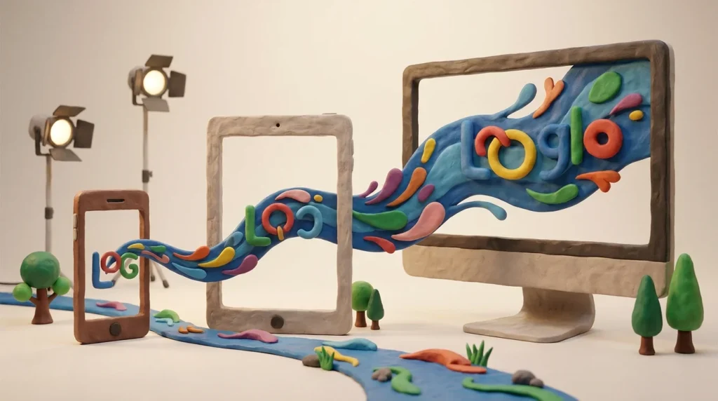
Explore the essentials of responsive logo design and ensure your brand identity shines across all devices.
In today’s digital age, a logo must be versatile enough to adapt to various screen sizes. Responsive logo design is crucial for maintaining brand identity across different devices, from smartphones to large desktops. This article will guide you through the process of creating logos that are flexible and effective in any digital environment.
Understanding Responsive Logo Design
Responsive logo design involves creating a logo that can adjust to different screen sizes without losing its core identity. This concept is vital because consumers access content on a multitude of devices, each with varying dimensions. A responsive logo ensures a consistent brand presence, whether viewed on a mobile phone or a widescreen monitor.
The Importance of Simplicity
A simple design is often more adaptable. Complex logos with intricate details might lose clarity when scaled down. Simplicity allows a logo to be resized without compromising on legibility or recognition. To achieve this, focus on core elements and avoid unnecessary embellishments. Simple designs are more versatile and easier to adapt.
Using Scalable Vector Graphics
Using vector graphics is essential in responsive logo design. Vectors allow logos to be resized without quality loss because they are based on mathematical equations rather than pixels. This scalability is crucial for maintaining the sharpness and clarity of a logo across all screen sizes. Learn more about the benefits of vector graphics in logo design.
Incorporating Flexibility in Design
Designing a flexible logo involves considering different versions for different contexts. This might mean having a full version for large screens and a simplified or icon version for smaller screens. This flexibility ensures that the logo remains effective and recognizable, regardless of where or how it’s displayed.
Testing Across Devices
Testing your logo across various devices is a crucial step in the design process. This helps identify any issues with readability or recognition at different sizes. By viewing your logo on different screens, you can make necessary adjustments to ensure it looks great everywhere. Consistent testing is key to successful responsive logo design.
Using Negative Space Effectively
Negative space can be a powerful tool in responsive logo design. It helps in creating logos that are both aesthetically pleasing and functional across various sizes. By utilizing negative space, designers can craft logos that maintain their integrity when scaled. For more insights, explore how to use negative space in logo design effectively.
Leveraging AI Tools for Design
AI-powered tools can significantly streamline the process of creating responsive logos. These tools offer intelligent suggestions and automate scaling, saving time and ensuring precision. AI can help designers create multiple versions of a logo quickly, making it easier to adapt to different screen sizes. Discover how AI is revolutionizing logo design.
Achieving Brand Cohesion
Maintaining brand cohesion is essential when designing responsive logos. The logo should consistently reflect the brand’s values and identity, even when it appears differently across devices. By focusing on core elements and ensuring adaptability, designers can achieve a cohesive brand image. For further guidance, explore how to achieve brand cohesion through logo design.
In conclusion, responsive logo design is an essential aspect of modern branding. By focusing on simplicity, scalability, and flexibility, you can create logos that effectively adapt to any screen size, ensuring your brand remains strong and recognizable across all platforms.
Color and Contrast Considerations
When designing a responsive logo, color and contrast play a vital role in ensuring visibility and recognition across different screen sizes and backgrounds. A logo’s color palette should be chosen carefully to maintain consistency and brand identity, while also ensuring it stands out regardless of where it appears.
High contrast color combinations can enhance readability and impact, especially on smaller screens where details might become more challenging to discern. Consider the background on which the logo will appear; a logo that looks good on a white background might not be as effective on a dark one, and vice versa.
- Primary and Secondary Colors: Define a primary color that represents the brand and secondary colors that complement and enhance the primary hue.
- Contrast Testing: Test the logo in grayscale to ensure that it remains effective without color. This can highlight contrast issues that might not be immediately apparent otherwise.
- Adaptability: Create versions of the logo suitable for dark and light backgrounds to maintain visibility and impact.
Typography in Responsive Logos
The choice of typography in a logo is crucial, especially in responsive designs where the text might need to be scaled. The font should be legible at various sizes and should contribute to the overall brand identity.
When selecting typography, consider both the style and readability. A clean, sans-serif font often works well in responsive environments due to its clarity and simplicity. However, the choice of font should align with the brand’s tone and image.
- Font Selection: Choose a font that maintains readability at different sizes. Avoid overly decorative fonts that might lose legibility when scaled down.
- Text Hierarchy: Establish a clear hierarchy in the logo’s text elements, if applicable. This might involve varying font weights or sizes to emphasize different parts of the logo.
- Responsive Typography Solutions: Consider using variable fonts that allow for adjustments in weight and width, enhancing flexibility across different screen sizes.
By thoughtfully considering color, contrast, and typography, designers can create logos that are not only visually appealing but also functional and versatile across a range of digital environments.