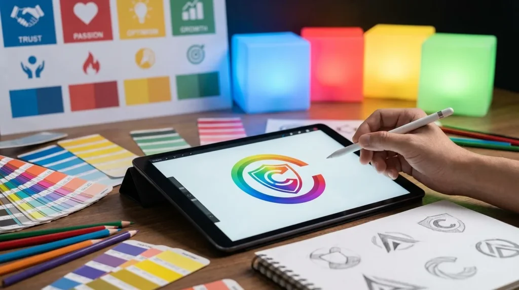
Color is one of the most powerful tools in branding. Before a customer reads your message or learns about your product, they feel something based on your visual identity – and your logo’s color is often the first emotional trigger.
Studies in color psychology show that people form subconscious impressions in seconds. The right color can attract the right audience, communicate your values, and make your brand instantly recognizable. The wrong color can send the opposite message and create confusion.
This is why choosing the right color palette matters just as much as choosing the right logo style.
In this guide, we break down what each major color communicates, when to use it, and how you can quickly test multiple color directions using Desigun’s AI-powered logo generator.
Why Color Matters in Branding
Colors influence how customers perceive your brand’s personality. They shape emotions, expectations, and trust levels before any words are spoken.
A few examples:
- Blue communicates trust and professionalism.
- Red signals energy and urgency.
- Green is associated with growth and health.
- Black suggests luxury and authority.
Choosing your color strategically means you’re not just designing a logo – you’re shaping your brand’s emotional impact.
What Each Color Says About Your Brand
Below is a clear breakdown of how each color affects perception and when it works best.
🔵 Blue – Trust, Stability, Professionalism
Blue is one of the most widely used brand colors in the world. It’s calm, dependable, and universally positive.
Used by: Facebook, PayPal, LinkedIn, Visa
Best for:
- Tech companies
- Financial services
- Healthcare
- SaaS platforms
Why it works:
Blue feels safe and reliable – perfect when trust is a core requirement.
🔴 Red – Bold, Exciting, Attention-Grabbing
Red captures attention instantly. It’s associated with passion, urgency, and movement.
Used by: YouTube, Coca-Cola, Netflix
Best for:
- Entertainment
- Food brands
- Retail
- Sports
Why it works:
Red creates energy and drives action. Ideal for logos that need to stand out fast.
🟡 Yellow – Optimistic, Friendly, Creative
Yellow feels warm and cheerful. It’s a welcoming color that suggests creativity and positivity.
Used by: Snapchat, Ikea, McDonald’s (accents)
Best for:
- Lifestyle brands
- Children’s products
- Hospitality
- Creative services
Why it works:
It’s bright and memorable – but should be balanced carefully to avoid overwhelming the design.
🟢 Green – Growth, Balance, Nature
Green represents health, sustainability, and renewal. It can also signal financial growth.
Used by: Spotify, Whole Foods, WhatsApp
Best for:
- Eco-friendly brands
- Wellness & health
- Agriculture
- Finance
Why it works:
It’s calming and natural – perfect for brands that focus on wellbeing or progress.
🟣 Purple – Luxury, Imagination, Individuality
Purple carries a sense of premium quality and creativity.
Used by: FedEx (accent), Twitch, Yahoo
Best for:
- Beauty & skincare
- Luxury brands
- Creative companies
- Tech products
Why it works:
It feels unique, stylish, and slightly mysterious – great for brands that want to differentiate.
⚫ Black – Elegance, Power, Simplicity
Black is bold and confident. It suggests quality, exclusivity, and authority.
Used by: Chanel, Apple (variations), Nike
Best for:
- High-end fashion
- Luxury services
- Minimalist brands
- Tech hardware
Why it works:
It’s timeless and versatile – and pairs well with almost any secondary color.
⚪ White – Clean, Modern, Pure
White isn’t often a “main” logo color, but it plays a crucial supporting role.
Used by: Apple (white versions), Adobe (white variants)
Best for:
- Minimal brands
- Wellness
- Modern tech
- High-end simplicity
Why it works:
White communicates clarity and cleanliness – it helps other colors shine.
🟠 Orange – Fun, Friendly, Energetic
Orange blends enthusiasm with approachability. It’s bright but not as aggressive as red.
Used by: Fanta, SoundCloud, Fiverr
Best for:
- Creative industries
- Food & beverage
- Fitness
- Startups aiming for a youthful identity
Why it works:
It feels active, warm, and innovative.
How to Choose the Right Color for Your Logo
Here’s a simple framework:
- Start with your brand personality.
Is your brand calm or energetic? Luxurious or friendly?
Match color to emotion.
- Consider your target audience.
Luxury buyers react differently than gamers or parents.
- Look at industry expectations.
Finance leans blue; eco brands lean green; wellness leans soft neutrals.
- Test multiple versions.
Seeing your logo in different colors is the fastest way to discover the right direction.
How Desigun Helps You Explore Color Choices Instantly
With Desigun, you can:
- Generate logos in multiple color styles
- Experiment with warm vs cool palettes
- Explore minimal, bold, modern, or premium tones
- Save your variations in one dashboard
- Compare them side by side before unlocking the final files
This removes guesswork and lets you see which color direction actually fits your brand.
Final Takeouts
Color is more than decoration – it’s communication.
It shapes emotion, expectation, and trust within seconds.
Choosing the right color for your logo helps you:
- Attract the right customers
- Express your brand personality
- Stand out in a crowded market
- Create a cohesive visual identity
When you use tools like Desigun to explore multiple color directions quickly, finding the perfect palette becomes faster, clearer, and far more creative.