How to Use Opacity and Transparency in Logo Design
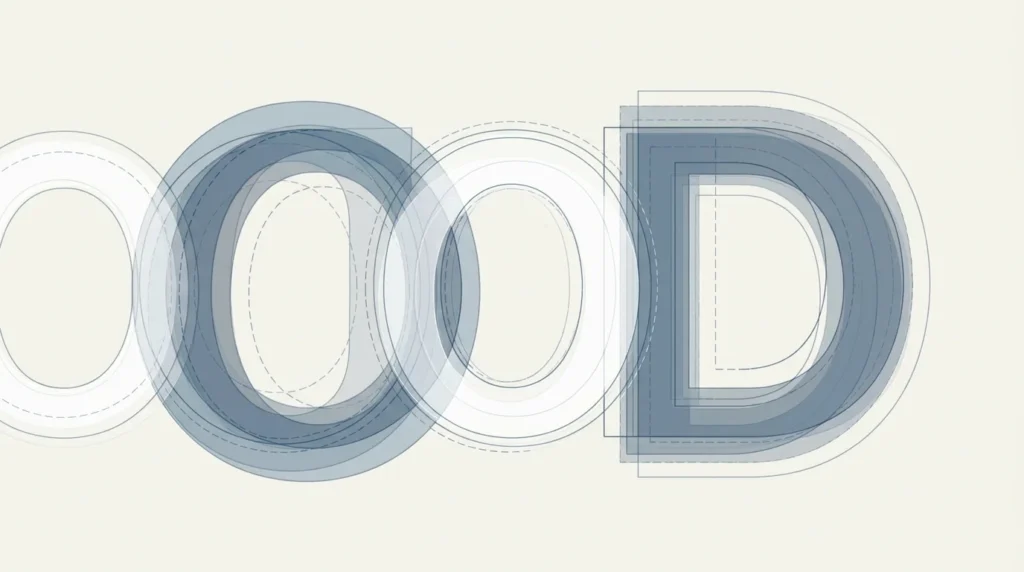
Master the art of using opacity and transparency in logo design to create visually compelling and memorable brand identities.
In the realm of logo design, opacity and transparency are powerful tools that can transform a simple design into a captivating emblem. These elements allow designers to play with visual layers, creating depth and intrigue that can enhance a brand’s identity. Mastering the use of opacity in logo design can set your work apart in a competitive market.
Understanding Opacity and Transparency
Opacity refers to the degree to which an object blocks light. In graphic design, this translates to how solid an element appears. A fully opaque object is solid and blocks everything behind it, while a transparent object allows elements behind it to show through. Understanding these concepts is crucial for implementing them effectively in logo design.
Transparency, on the other hand, is the opposite of opacity. It involves allowing other design elements to be visible through a layer. By adjusting the transparency of certain elements, designers can create a sense of layering and depth that adds complexity and interest to a logo.
The Benefits of Using Opacity in Logo Design
One of the key benefits of using opacity is the ability to create subtlety and nuance in a logo. By varying the opacity of different elements, a designer can draw attention to specific parts of the logo or create a harmonious balance throughout the design. This technique can be particularly useful in creating a layered effect that adds dimension without clutter.
Moreover, opacity can be used to soften harsh edges or integrate different elements more seamlessly. For example, a logo that incorporates both text and imagery can benefit from varying opacities to ensure that neither element overpowers the other, achieving a balanced composition.
Creative Applications of Transparency
Transparency allows designers to create logos that are not only visually appealing but also conceptually rich. By using transparent elements, designers can suggest meanings or themes that align with a brand’s values. This technique can be particularly effective for brands that want to convey a sense of openness or innovation.
For instance, a tech company might use transparency to suggest fluidity and cutting-edge technology. By overlapping transparent geometric shapes, designers can create abstract forms that suggest movement and progress. This approach not only enhances the aesthetic appeal but also reinforces the brand’s narrative.
Combining Opacity with Color Theory
Color theory plays a significant role when working with opacity and transparency. Colors can interact in surprising ways when their opacities are adjusted. This allows designers to create unique color blends that can give a logo a distinctive look. Understanding how colors blend and contrast is essential for creating logos that are not only visually striking but also aligned with brand messaging.
For example, using a translucent overlay of complementary colors can create a vibrant effect, while analogous color schemes can ensure a harmonious and cohesive design. Designers can leverage these techniques to enhance the visual storytelling of a logo.
Common Challenges and How to Overcome Them
While opacity and transparency offer exciting possibilities, they also come with challenges. One common issue is the potential for a logo to become too complex or visually overwhelming. To avoid this, it’s important to maintain simplicity and clarity, ensuring that the main elements of the logo remain easily recognizable.
Another challenge is ensuring that the logo remains effective across different mediums and backgrounds. Designers should test their logos in various contexts to ensure that the use of opacity and transparency does not compromise legibility or impact. For more tips on avoiding common design pitfalls, consider exploring common mistakes to avoid in logo design.
Incorporating Opacity in Modern Logo Trends
As logo design continues to evolve, opacity and transparency are becoming increasingly prevalent in modern trends. Designers are using these elements to create logos that are not only aesthetically pleasing but also adaptable to various digital and print formats. This adaptability is crucial in a world where brands need to maintain consistency across multiple platforms.
Furthermore, the integration of opacity in logo design aligns with the growing trend towards minimalism. By using subtle layers and hints of transparency, designers can create logos that are simplistic yet sophisticated, capturing the essence of the brand without unnecessary embellishments.
Utilizing Opacity for Brand Differentiation
One of the most compelling reasons to incorporate opacity into logo design is to achieve brand differentiation. In a crowded marketplace, a unique visual identity is essential for standing out. Opacity can be used strategically to highlight distinct elements of a brand’s identity, ensuring that a logo is not only memorable but also uniquely tied to the company’s ethos. By varying the opacity levels, designers can create a signature look that becomes synonymous with the brand, thus enhancing recognition and recall among consumers.
For instance, a brand that emphasizes eco-friendliness might use varying levels of opacity to create a ‘leafy’ texture or a sense of natural light filtering through foliage, subtly reinforcing their commitment to sustainability.
Creating Interactive Logo Designs
Another innovative application of opacity and transparency is in the realm of interactive logo designs. As digital platforms continue to dominate brand interactions, logos must often transition from static to dynamic environments. By playing with opacity, designers can create logos that respond to user interactions, such as hovering or clicking. This dynamic use of transparency can engage users more deeply, offering a sense of discovery or transformation as they interact with the brand’s digital presence.
For example, a fashion brand might employ opacity changes in their logo to reveal different color palettes or patterns upon user interaction, aligning with seasonal collections or promotional themes. This not only captivates the audience but also keeps the brand experience fresh and relevant.